I really liked the 2016-17 version, but haven't finished it, so I debated about starting another one. Went away and looked for the other things I was there for, and then came back. I won't usually buy more than one or two blasters of anything at one time, but I "did a Stuart*" this time and dove in and bought all three.
 |
| *Stuart is my friend in Michigan who buys a lot of retail, sometimes no matter the diminishing returns. |
Backs have the same picture overlayed with five years of stats and a small black number tag in the corner. The name strip and logo also reappear on the flip side.
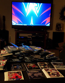
So as the Caps pre-game was coming on, I set up my tray and started ripping.
Twelve packs of ten cards each per blaster. So not bad for your average retail box.
Knocked 'em all out one after the other, while watching the preview of the Caps-Punkwangs.
I finished so quick I didn't actually watch the game until the third period. Didn't end well.
But my results were pretty nice. Noticed some dupes in the stack of base cards, but thankfully didn't feel like I duplicated a whole box at any point.
And was lucky to pull an auto, though it's a prospect that I don't know - Adam Gaudette of the Canucks. Will trade for a Caps auto. The two small piles of base in the photo are the Capitals, which I'll double up on, and the parallels.
I like the inserts. Most are nice and shiny, and the themes are typical, but interesting, and not just star player glorification. I won't break them down here, but I can briefly give you an idea about them. There aren't many pictures on the TCDB yet, so you may check there later.
- Ice Ambassadors are actually basically star worship to an extent, but it's OK if they only do it once. These look nice with the gold background and cool fonts.
- Original 6 focus on one player from each team's Past, Present, and Future.
- Parkhurst Permits harken back to 1995 Studio baseball that look like passports of players from all over the world as members of Canadian and American teams.
- Prominent Prospects. Shiny rookies...blah blah blah. Hopefully I got at least a couple of the guys that are going to be hard to find.
- View From The Ice are the neat perspective shots from the net cameras. Not all are right behind a sprawling goalie.
- There are also apparently "Tall Boys" which are "e-Pack exclusives". Whatever they are.
Haven't sorted my base yet, but I feel like I should be able to trade for the rest of the 380 that I'm missing. Let me know if you've taken the plunge into these as well.


These are Wal-Mart exclusive. I don't think my Walmart carried them, they never brought in the 17-18 set.
ReplyDeleteThe Walmarts in my area no longer carry cards... which is a shame, because I'd love to get my hands on some Gallery. Anyways... good luck on this set. Decent design. My only complaint is the use of the same photo on both the front and the back.
ReplyDelete