#3 - 1995 Score #115 Bud Black
Not one of my favorite designs in the first place, mostly because of the default 90's teal color plowing through the basepath dirt contrasted by the violet blue namestrip. A ghastly combination. And then the photograph is rather unique, but almost obscures the featured player completely. It's a lot worse in hand - the scan emphasizes the focus on the face. A few feet to the right would have framed it a lot better without losing the intended depth.
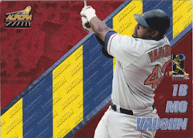
#2 - 1998 Pacific Aurora Pennant Fever Red Mo Vaughn.
Now I generally like Pacific in all their foily over the top gaudiness, but these are just bizarre. This is actually an insert set - and a parallel one at that - of an unusual base set.
This is the base product. Interesting concept, but the position line is way too big, as is the city text. Thin those out and expand the action pic and you might have something.
But back to Mo. The regular inserts are actually gold or bronze (can't really tell from the scans on TCDB). This red parallel series keeps the random colored stripes through the middle of the background echo picture (the what? - I'll show you) but washes it all in blood red.
See here, I've outlined the embossed "echo picture", which I define as a second image identical to the featured picture. They are almost always identical and totally redundant. It's OK, but lazy to put the same image of a player on the back as the front, but I really hate echo pictures on the fronts of cards, especially when they're distorted.
But that's the least of the APF's design woes - where does the blue and yellow come from? That isn't Boston's colors, nor do all of Boston's (or any team's) players have the same colors in this set. Plus, what is the purpose of the team-lettered stripe? No idea. But it looks awful against the uniform and the red background. Not to mention the Player's Association logo which jumped up front for some reason too....
The back doesn't help much either. The scheme changes to green.
At least the angle of the gold band (complete with Windows logos at each end...???) is at the same angle as the useless color band on the front. The logos repeat. Bonus points for readable text, though.
#1 - 2012 Topps Classic Walk-offs #CW-3 Johnny Bench Or pretty much all of them.
I finished my master-ish set of 2012 Topps a while after they came out. I've never added these inserts. This is Topps' most blatant example of starting with the auto-relic hit and working backwards (quickly and lazily) by subtraction to get the base insert. I reviewed the 2012 inserts and offered my upgrades to their designs.
All of these have at least two echo pictures. A few have three. THREE! The same image re-cropped and shown three times on one card. I have to pause to compose myself. Not sure whether to laugh, cry or scream. Then in Bench's case, the team logo, which occupies the space reserved for the relic swatch, is (accurately) plain white. Therefore the only color on the whole card is on one quarter of the total area. Stuck between the parallel lines that make it look like those sliding chalkboard panels that move in front of each other in older school buildings. the bottom picture on the right 2/3 of the front is faded so that the signature that you didn't get will show better. Or remind you that you didn't pull the signed version.
I had to make an improved version again.
Ahh, much better.
I visualized my "ugliest card" to be something with a lot more gaudy foil against sickening color combinations with a badly cropped photo, but this will do. These are the cards that I can think of the quickest that I can't stand the most. A couple times I've seen them cheap, and considered finishing the master set just for the sake of completism, but I couldn't bring myself to do it. Maybe if I find the whole set in a dime box at a show somewhere down the line.


Your Bench does look much better than the original :)
ReplyDeleteAgree with Jon. Yours looks at least 3x better.
ReplyDeleteThank you for contributing to the contest with some truly ugly designs. I was baffled by the color stripes on Vaughan's card, too.
ReplyDeleteWow, you really proved your point by switching out those photos - I love your take! A little effort from the old bubblegum company would have turned that drab slab into an eye-catching insert.
ReplyDelete