Thursday, August 16, 2012

2012 Topps series 2 inserts tweaked

Four posts (and six months) ago, I took the Panini inspired designs of the Topps flagship inserts and tweaked them to look like they were meant to be normal cards instead of relic autos missing the swatches and signatures.  Here's my take on series 2.

The Mound Dominance inserts aren't bad.  The logos could use a bit of growth or something, but I guess they were intended to hit the center of the strike zone.

A Cut Above inserts are actually that - a step above most of the lackluster stuff that came with this set.  Nice die-cut shape and full pictures with text that's just the right size.

Career Days are not so lucky.  There's a big team colored area on half the photo that just basically throws the balance of the whole composition off.  They look like this:


Sorry, no sig for you!  Looks like there was a gunfight just between home plate and the on-deck circle that they couldn't clean up by game time.


Why not just make a properly balanced card like this?  Now I know the photo may not be from that particular game, but what guarantee do we have that the one above IS?   I will admit that I like the daytime photo better for the lighting and contrast behind the logos, but it's the layout that's got to go.

Oh, and did you see DiMaggios?  It's the same photo that was used in Gypsy Queen and Marquee.


Sunday, July 01, 2012

Video Mashup - Da Hawpa


Here's something I've been thinking about doing for a while (ever since the Dish Network ad).  Created just for fun with apologies to Dish Network, the sports media, and all the copyright holders, videographers, etc.  Hope it's good for a laugh.  Wish it would show bigger on Blogger.

Update: I added a shot of Harper-Hater Cole Hamels to make it clearer who was saying "Shaddup!".

Sunday, April 15, 2012

A Full C(a)rd of Lumber

Thanks to Check Out My Cards, I have finally finished what I think is the coolest insert set ever.  I now have all 18 Lumber Yard inserts from 2002 Upper Deck 40-Man.
The fronts of the cards are actual (bat? - BB Cardpedia says no.) wood, laser etched with the player photo, team logo and set logo.  The backs have the same photo in real color and a brief blurb about the players exploits.  You can tell these came out mid-season, because a few of the write-ups on active players include details about their performances up to mid-May 2002.  (CardPedia says July)
I just like the way they look and how much detail could be carved into the wood.  The streaks in the scans are just the penny sleeves....


I pulled most of them from boxes of 40-Man as I was building the set, sometimes even from partial boxes (Pujols).  Don't think I ended up with more than one duplicate.
I got the last few from eBay, notably Mantle (for which I probably paid the most), Griffey Jr., and Frank Thomas.  One night last week I arbitrarily Googled the Chipper Jones - the last missing one - and found that Amazon had a listing for it for $12.50.  Upon further investigation, I found it was actually sold by COMC.  So since I had recently created an account, I went in and jumped on it.  Then, to make the shipping worthwhile, I shopped for some other stuff I haven't been able to find - namely inserts from 2005 UD All-Star Classics.  Then I searched for my two latest player collection guys - Brian Matusz and Dan LeFevour.  I ended up with about $60 worth of stuff in that order.


I've seen the whole collection for sale by Kruk Cards on eBay.  Can't remember how much he wanted for them, but I think it was approaching four digits.  I tried not to spend more than just below high book value, keeping it closer to low book in many cases.

 
Here is a bigger scan of A-Rod's card, front and back.  Click on them to see 'em bigger (same goes for any of the other scans).  You can see they replicated the stripes from the back, which ties both sides together nicely.  I like how the wood grain shows in some of them too.


 Now all I have left for a "master set" of this 1182 card monster is to finish the Mark McGwire Flashbacks.  I still need #1  4  7  19  27  30  31  33  34  38  and 39 out of the 40.  When I say master set, I mean all base, and these two insert sets.  I didn't try for the three jersey subsets, or the Electric and Electric Rainbow parallels.   The McGwires can be had for a couple bucks apiece on either COMC or SportLots.  I'll probably clean them up there after I check at this year's National in Baltimore.  But the best part is now over.  I've never seen Lumber Yard inserts at a show, ever.  I always glance at dealer mojo hit cases, but not once did I spot an all wood beauty like those above.  Now I don't have to search any more!
Monday, March 12, 2012

Star Trek - The Retro Football Card Set - card #6


1934 Diamond Matchcover Dr. Leonard McCoy.  Fonts match better to the green example of these covers.  The name over the football came in a couple different fonts.  I didn't have anything to match the one in the tan original.  Also had a hard time figuring out what to substitute for the football.  Not many sketches of the original NCC-1701 starship out there.  Nice oddball item instead of the same old Topps or Philadelphia designs.  I'm running out of cool designs to use.  There aren't as many nice ones for football as there are for baseball.

Saturday, February 11, 2012

My Concise 2012 Topps post

Since there are a ton of posts about Topps' new release, I'll make this quick and efficient.

Base set - Great photos.  Fun shots that aren't overprocessed like 2009 and 10 looked to me.  Numbers are clear and easy to sort.

Parallels - Not real impressed with the golds.  Haven't seen the retail ones yet.

GUs, SPs and giveaways - As usual, didn't pull anyone impressive.  See inserts rant below.  I don't expect to see any of the SPs.  Curious to see what comes up for all my codes this time.

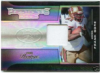
Inserts - Topps has (re?)hired the Panini football design team and they are still lazy bastards.  What they came up with are auto jersey cards and then just removed the good stuff to make the regular insert.  Each insert looks like a football card from Panini's past.  To wit:

Not bad, but why is there still a space for an autograph?

Look familiar? Sorry, no autograph for you!!


Plain

Auto

Relic

Plain (though crummy Chromey)

Auto
 
Relic (in a crappy location)
Only difference is that it seems the 2012 baseball guys are either relics or autos, not both.

Nice design, but it's not finished.

This one has the gall to put it in writing that you got
gypped out of an autograph. Kinda rubs it in your face.


Now what they should have done with this....

...Is finish the coloring.  Now that's not a bad looking card.


 This is the most hideous design of all - redundant pictures that you
can see, and a different one that's faded for no reason. 
Huge blank areas, and a dinky logo that doesn't fill the space. 
Plus, silver foil on grey?  Eccch.


Now that would have been better.  No gaping holes.


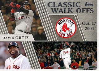
Worst part about the whole thing is that I'm still going to go after all of them except the Walkoffs.

Monday, February 06, 2012

Super Bowl summary

My condolences to all the sportscasters who are depressed over their man-crush's loss last night to the 9-7 NY Giants.
Good game, but would still have preferred a Harbaugh rematch.

Saturday, January 21, 2012

Fausto to Roberto correction - 2011 ToppsTown

The former 28 year old Fausto Carmona, was revealed to actually be 31 year old Roberto Hernandez Heredia after being arrested in his native Dominican Republic.  He was charged with using a false identity, which isn't actually that unusual for Dominican players, so it's been reported.

Too bad the card year is just turning over next month, or Topps et al may have had the opportunity to issue corrected cards of Mr. Heredia.  They might look something like this:


Monday, January 09, 2012

Happy Birthday to me (and the Duchess)

Celebrating my 45th today.  Only two weeks after Christmas, so I don't make a big deal about it.  Missed Elvis by a day, so I've been stuck with Richard Nixon.  Though this morning I learned that Kate Middleton, Duchess of Cambridge was also born this day in 1982.


She's a lot prettier than old Tricky Dick!  Bit far to go for a birthday kiss though...