Now for the third and final installment of my A&G breaks. Hoping for at least a hit of someone I actually really like...
Box topper is an N43 this time. I generally like these, but they're hard to complete - or at least expensive - so I've only done it once, in 2009. Finally, an older player!
Feels like these are a slightly different size this time, but maybe it's me. I put a regular silver card behind it for comparison.
First hit (about halfway through like the others) is Acuña. (ñ = ALT-164). Haven't pulled a bat relic in a while. Nice that it says "game-used". Again, I like this relic style better than the other full-size one.
Mini inserts include a World's Tallest Mountain. It was the only one I got, so I assumed they were scarce, though mountains isn't a subject you would think would be so chase-able. Not likely doing those either.
Some decent names in the player minis. Is Skenes the guy I should put on top? Had to check to see if the shiny Pereira was the same Yankee as the jersey I got in Box #1, but that was Peraza. There's a repeated name here that I'll come back to as well.
Second hit is an auto from a player who appears in a different team than I expected. (Are you getting annoyed with how clueless I am about current players yet?) I would say this is the best hit of the break as far as regular hits go. The third one may make you think differently, though.
I'd say a Bloodhound would more fittingly be named Trombone than Trumpet, but OK. X-Ray'd's are still really fascinating. Top right is not an insect, it's an Armadillo. Feels like one more box, and I'd have had all the regular inserts. A&G collation (and my dealer's box selection) is always excellent.
What can beat a shiny Mickey Mantle? (Well, a refractor, I guess, but I'm not complaining. Not that I'll probably keep it for long.) Might have to flip a coin to see if Night Owl or Fuji gets the Filigree Yamamoto...
Final hit ~ not a Double Rip Card, but I got double Rips in the break!
And remember the same name minis? Call it a Slade Cecconi hot box! Or even a Diamondback hot box. Wouldn't be my first choice. (No offense, D-Back fans).
Before I reveal the contents, I'm happy to say I got at least one Jayden Daniels. He's not a short print in the set, but only getting one makes it feel like he's one of those Scarce Pulls but not SP's - like Jeter used to be. This base card is about the only one beside the Trick-Or-Treat Score that's not $5-$100 right now. I'm not going to have an easy time collecting this guy. I didn't actually get a Palmer base card at all, which was also surprising.
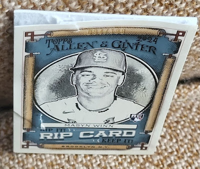
But anyway, back to the Rip card. I cut this one correctly this time. You can see here the relative depth of the chamber and the pull tab on the back. What was in here?
Extended number Ohtani!
Woo Hoo! Paid for the boxes, right? Not quite. EBay auctions are around $20-30. Which is still nice. Will definitely trade for an upper level mini or something of my player collections. Daniels, Palmer, Bo Jackson, etc.
I have since received all but the Palmer (x2) and a second Daniels for the base set, the remaining SPs and full size inserts except for three X-Ray'd's (15, 17 & 19). I also want three of the Cycle Successions (are these retail inserts?) Torre, Fisk, and Keith Hernandez, as well as the Uniform Countdown of Dusty Baker. I hope to finish the Got the Itch minis before they're all sold out too, but will probably have to count on trades. Hope they're not too scarce.
Still have a lot of my player minis to trade, except the A&G backs. And all the mojo hits are available as well. Got a few insert dupes, and about 40 base extras and most of the Chromes. Let me know what you need!


