Originally, I thought I would keep up the Borg / Trek theme in more than just the look of the blog, but that soon fell to the wayside. Was thinking I would analyze cards and products in the deadpan style of the Collective, but it would have become cumbersome and cheesy after a while, so I let it go. The main concentration of "trekkiness" is in the banner. It started out like this:
The background and colors were already established. Then I found the cool cyborg font...
Here's a better look at the first background. Tried to represent the major parts of my collecting. Set building ('72s), Priest Holmes player collection, vintage sets, etc. Then threw in some star cards and game used just to appeal to a wider audience, so to speak.
Went with that for about a year, and then changed the cards and computer controls...
New background looked like this:
It was really just a rearrangement of half of the same items in a somewhat less random layout. Turned out a bit less busy, but still keeps that "only a Borg could use it" look.
And then today did it all over again. Was tweaking the color saturation and contrast between the titles and the background, and the cyborg font came out with a lot more depth...
But I could only get it to be this pale green or whiz yellow, so I went back to the plain white you see at the top of the page. I played around with saturation and luminance and got a couple other color combos that I may show later.
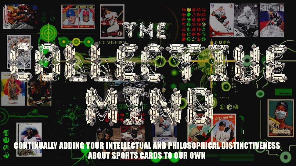
Here's the new background:
See if you can find some of the more subtle things. There's the retro Topps logo (in place of an original skull), three representations of sets I've finished in the last year (listed as "Assimilation Complete"), and one of my custom Leading Ladies images. There's the AAF card analysis on the left - computer is trying to compare it to NFL heroes. And the hotness detection up top,
Major pieces of the techy stuff came from this image I found. Converted some parts to green to match the other stuff and the background colors already on the blog. (Not that it matches well, though).
I'm still wondering if I should mellow the white post body text a shade or two. Looking at Night Owl's new theme, it's very easy to read the posts. (Just not easy to read the preceding posts from the top one).
What say you?
Should I keep this white text? Or mute it down a little? Or a lot?
How about the banner? Stay with the bright titles or try it with some color?


This all looks terribly complicated! I'd love to change my header, but stealing an image from the internet, and then taking two hours just to figure out how to put the blog's title over it, was about all I could do. I haven't learned any other design skills since, so it'll probably have to stay as is for awhile. As for your design, I've been big fan of the Borg look, and hope that you don't end up changing it too much.
ReplyDeleteKeep the white, please. Or the first gray shade option. Any darker and it's impossible to read, with my eyesight.
ReplyDeleteI think you could probably get away with muting down the text just a little bit. (Sometimes bright white text on such a dark background can get tough to read on a screen after a while). The banner is really nice as it is now. I like how the cards in the background appear a bit farther in the background. It makes the title stand out.
ReplyDeleteI'm glad my new layout is readable. I always get nervous with white type on a black background. I do find that if the white is super bright, the text starts to dance around a little as my eyes get tired. If your posts aren't long it's probably not a factor, but mine tend to get long.
ReplyDelete