Showing posts with label upgrades. Show all posts

Wednesday, August 23, 2023

Suite Experience At Camden Yards

While I was on vacation, one of my co-workers (who is always after a deal) arranged for a few of us to see an Orioles game with one of our vendor companies.  But this wasn't going to be just another evening in the stands making runs to the food counter and souvenir shop.  

It was the August 8th matchup with the Houston Astros.  We left work around 4:30 and arrived about an hour before first pitch.  The first bonus was a parking pass that put us really close to the home plate entrance.

It was the first time I had used an app for tickets to an event.  The MLB Ballpark app is pretty much about tickets, even though it talks about following any player, and other things.  It's about the tickets.  Anyway, we went in the door and then in the elevator to the fourth floor.

We stepped off into what felt like a hotel lobby.  It's the Club Level.  There's a reception desk and tons of historical information, artifacts, trophies, and artwork about the history of the Orioles on every wall and in the hallways and lounges all the way around this floor of the building.

This is a stock shot I took off the internet to show some of the other areas.  I snapped the rest of the pics, but stuck to the stuff that interested me.  I haven't asked my friends to send me theirs yet.  I'm sure they shared them on social media.

These jerseys were right behind the main lobby.

This Frank Robinson panel was down one of the walkways to the upper seating sections. 

This side room was all about Cal Ripken.  I don't think these were the original numbers that hung on the side of the warehouse when he was breaking the streak, but I could be wrong.  Seems like they'd be a lot bigger.

This painting was in our actual suite.  There were cafe tables, couch seating, the buffet (quesadillas, hot dogs, salads, sodas, adult beverages, the whole works!), a private rest room, and a glass wall with two sliding doors that lead to the outside seating.  You sat in rolling office-style chairs outside.  Here was our view:


We were up the third base line.  It was a great evening to watch a game.  Not too hot or cold.


I snapped pics of the starting lineups.

The O's got off to a rousing start with two home runs from Adley and Mountcastle.  They built a 6 - 3 lead into the 9th inning.  Unfortunately, the closer Bautista, who came into the game with great fanfare ~ flashing lights and dramatic music ~ couldn't get anyone out and they lost in the top of the 9th.  Stupid Astros...

Other than that it was a stellar experience.  One of the hosts knew the Orioles Alumni Director, who came by and brought Larry Bigbie in to meet our group and sign autographs.  (I passed.)  The other company that sponsored the event bought several different hats for everyone.  They were nice.  I got a regular O's hat with the Jackie Robinson 42 patch on it.

Hopefully, we can do that again before the season is over.  

I still haven't watched more than a few games this year.  I should pay more attention since they're going to be in the playoffs.  I'll watch more of them then.
Thursday, December 08, 2022

I Am Now A Scanning Machine

OK, not quite like that...

I recently upgraded my ability to contribute images to the Trading Card Database as well as this blog and any other endeavors that use images of trading cards. 

Before, the normal method was a flatbed scanner, which in my case is the top half of my Canon inkjet printer.  Up to about nine cards would be loaded onto the scanner surface face down, covered with a piece of foam to darken the background, and then the lid is set on top. 

Then I use my Paint Shop Pro program from 1996.  Hit one button and it quickly sweeps the scanner bed and gives you a preview of what you've got set down.  Hopefully they stay aligned to the edges of the bed.  Then the scan area is designated, the picture mode selected, and the Scan button clicked.  A minute or two goes by while you wait for the scan to complete...bzzzzzzzzzzzzzzzzzzzzzzzzz...


Now you get the group image.  Each card you want to separate must be cut or copied and pasted into a new image file and cropped down, resized, and tweaked.


Quite often even when they don't move, the images are just so slightly rotated (shown by red area in picture) that it's only correctable by overcropping the image.  The Database is a bit picky that you don't leave any space around the edges.

So I've contributed a decent number of images to TCDB, but it's not an efficient operation.  Until now.

I have seen several videos about Fujitsu scanners and their use for trading cards. Now I don't sell singles on any sites that I need to scan, so I don't upload to services like shown in these clips, but it works for manually putting images on the Database too.

I got the Fujitsu fi7030 scanner.  They retail brand new for around $550.  I was hoping to find one for much less on a Black Friday deal.  No dice.  Then I realized that this model has been around a while, so there should be some on eBay!  From a quick Google search (initially from any store), I found one on there for just over $300.  But a lot of the cheap ones are missing the feeder tray and/or the AC power adapter - and that's a deal breaker.  I found one that was complete and tested by the store that was selling it - for just over $275 - but with a Best Offer option.  They accepted my $250 offer!  So I basically got one for half price! They're about the size of an average fax machine if you're old enough to relate to that.


You simply call the program up to scan and load some cards in the feeder.  Set off the process by clicking the button on the configuration that you set up initially. Pardon my quick & dirty phone videos...

The scanner starts feeding cards and is done in mere seconds. 

The images of both front and back are captured for each card as it passes through the machine.  Sometimes it flips them around, but that's correctable with a couple clicks.

Then you "release" that batch of scans into the folder you designated, and voilà!  Your images are there.  For the most part, they are cropped right down to the edges.  (I have my scan area set to exactly 2½ by 3½ inches, so there's little margin left.)

You can now go to the database or wherever you need the images and upload them into place.  The whole process takes less time than the first page of flatbed scanning typically would!  Plus, you can add batches to the ones you just scanned and get hundreds of images in just a few minutes!  Unfortunately, this model only really does regular base cards.  I tried a thicker jersey card and it wouldn't make it through the feeder.  I did confirm with a few junk cards that it doesn't leave marks on cards from the feeder rollers or anything.  I might be able to set it to mini size scanning in order to do those. They'd just have to be done separately.  The bulk of what I need to do is regular stuff anyway.

Watch out database!  Here I come!  I bet Database champions like Billy K have something like this...

Monday, August 01, 2022

Pasteboard Power Tour Finale: Chantilly, VA

Our last stop on the Power Tour was two days (Friday & Saturday) at the tri-annual show at Dulles Expo Center in Chantilly.

With one exception, I haven't really broken down my hauls by dealer.  You may recognize some of the price markings from Uncle Dick's among the groups shown here.

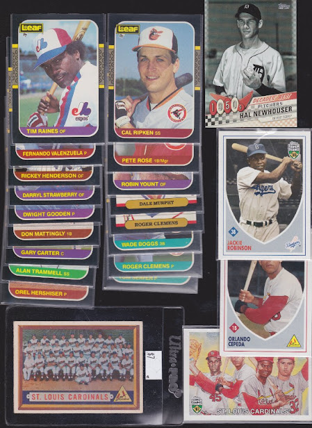
I'll lead off with the one separate purchase I scanned.  A very eclectic mix from the guy I call Brother Mike.  He's got an email mailing list that keeps you informed of where he is at all the local shows.  And he always works with you on prices.  I snagged up a couple inserts and base cards from Topps Super Teams, American Pie, '07 Sweet Spot Classic, and Topps Gallery HOF.  I'm down to only one of those Gallery variations now (#38 Bucky Harris with the red W on his sleeve).  I got about a dozen of them from Mike before.  Also found a couple nice '57 semistars and the Phillies team.

Ramped up my '50 Bowman purchases.  The Robin Roberts is an upgrade.  I'm at the point where it's time to bite the bullet on some of the more expensive missing ones.  The top four were still less than $10 each and the others were within the pre-boom price range.

These are all from Uncle Dick's too.  I'm starting my '62 and '63 builds with the variations even though I haven't officially started the sets.  Will wait until '64 is done and '57 is close until that happens.  But it's nice to have a lot of the odd ones out of the way.

Stuart hooked me up with Hal and the Leaf stars (for a setbuild later).  I did well on Super Teams this trip.


Found a dealer with a ton of quarter boxes full of chrome parallels, so I dove in on some Washington batches that I was lacking otherwise.  Also was shocked to find some of the premiere rookies from my 2015 Score set build in there too!.  Moses and Pastorini were from other buys.

More quarter box shinies and some vintage Washington.  Mr. James is an upgrade, and I ended up having more of those 4-in-1s than I realized.  Luckily I only bought one duplicate.

Going way back into the early 50's to finally knock out some of the older Washington needs.  Bowman larges and smalls that I finally pulled the trigger on.  Chet O I hadn't seen before.  Makes it tough when they are still listed with their colleges.

Speaking of vintage ~ more of my two older set builds, '58 and '68.

Got these three for like $60 total from and older couple.  I thought it was a great deal even though the wife was a bit sheepish about the offer.  Griese is fine, he's just in a tinted top loader.

And finally, the bargains of the day.  A young guy had mostly graded newer stuff, but there was one little box of vintage stars - a handful at most.  I saw these two and heard Hallelujah music in my head.  I said to him "Wow, are these because you don't do a lot of vintage?"  He replied that he had just looked around and figured out a good price for them.  I jumped.  Had one of my dealer friends inspect them just to be sure.  Effectively kills both sets.  I only need the Calvin Hill black name variation for '70.  And of course those short prints at the end of '72 are basically a fantasy.

Thanks for coming along on the Power Tour!

Friday, April 23, 2021

I'll Give You The Moon And The Stars

A while back, I saw an item on eBay that I thought would be a good addition to my Moon & Space binder.  It's not actually a trading card set, but a set of game cards.  

They're the 1984 Space Rockets trump game from West Germany.  Made by a company called Altenburg-Stralsunder.  It's a 32 card set comprised of eight groups of four.  Each card has stats on the bottom under several categories that determine the winner of each round when compared to the other cards thrown in with it.

They are grouped by Space Shuttle, US rockets, European rockets, etc.  The photos are really nice.  Rocket launches lend themselves to spectacular photography.  Here's the back....

The set was less than ten bucks, so I wasn't totally distraught when I got them, but was annoyed to find out that every card had at least one tack hole in it, except for the title card.


Needless to say, the seller didn't get the full five stars for the auction.  But since they were cheap, I didn't hit them with a negative.  And recently, I found another set for a similar price.  The only difference was the title card.

They fit quite nicely in 8-pocket (horizontal) sheets.  The catch is, since it's a 33 card set, the title card has to go somewhere else.  4 x 8 pockets = 32, of course.

The benefit for you is that I'm giving away the original set.  It comes in a plastic box that is kinda damaged too, but still works.  I have extra boxes just like it that I used to have similar game cards with race cars and motorcycles on, but I don't know what happened to those (Look out Billy, I might find them later).  So if you don't care about the box, I'll ship the original, or let me know if you want a better box.  If the tack holes don't bother you, I don't imagine the box will either.  They are still playable if nothing else.  For incentive, I can throw in an unopened pack of Space Shots (series 2) cards.

I guess the first request will get it, unless I get a couple enthusiastic responses, and then I suppose I might have to have a contest or bids for trades.  I'll watch the comments...

Friday, December 06, 2019

Victory At O Dark Thirty, Roger

Tuesday's mail brought the latest batch of 1964 Topps baseball set fillers to my door.  My man Marv in Michigan came through again!


Most of my list is the higher numbers, like these two, #474 and 511.


And of course, the rookies are the first to go out of dealer stock, so these are very welcome additions.


The green scheme of the Cardinals is a nice contrast to their red unis and dark caps.


A couple well-known managers.  Dark is an upgrade, and Hodges with the Senators is just cool.


O C is also an upgrade.  He looks like the tension of not measuring up to the rest of my set was stressing him out.


Sharp Yankees team that's a little off center, but that just makes it a more reasonable price.


No Yankees here, but some great names.  And Jim Maloney.  No offense Jim.  He looks as shocked as we are.


The second biggest card in this haul.  Maris against the batting cage.  The Yankees scheme is just about perfect with the black name plate and red team letters.


And the pièce de résistance, second year Pete Rose.  Great ballpark shot with the Rookie trophy in all its glory.

Now to go check these off my list.  I'm sure Marv will inquire about knocking out some more in just a couple weeks.  Thanks Marv!!

Monday, November 25, 2019

Updating The Software

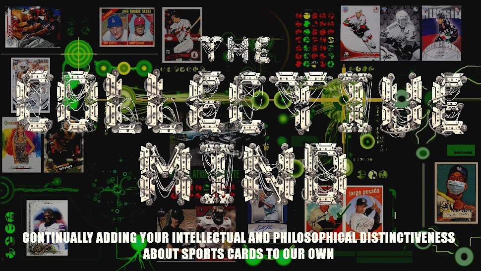
The blog header here has been the same for a couple years now, and since a few of the major blogs have had theme changes, I figured it was time for at least a tweak.

Originally, I thought I would keep up the Borg / Trek theme in more than just the look of the blog, but that soon fell to the wayside.  Was thinking I would analyze cards and products in the deadpan style of the Collective, but it would have become cumbersome and cheesy after a while, so I let it go.  The main concentration of "trekkiness" is in the banner.  It started out like this:


The background and colors were already established.  Then I found the cool cyborg font...


Here's a better look at the first background.  Tried to represent the major parts of my collecting.  Set building ('72s), Priest Holmes player collection, vintage sets, etc.  Then threw in some star cards and game used just to appeal to a wider audience, so to speak.


Went with that for about a year, and then changed the cards and computer controls... 


New background looked like this:


It was really just a rearrangement of half of the same items in a somewhat less random layout.  Turned out a bit less busy, but still keeps that "only a Borg could use it" look.

And then today did it all over again.  Was tweaking the color saturation and contrast between the titles and the background, and the cyborg font came out with a lot more depth...


But I could only get it to be this pale green or whiz yellow, so I went back to the plain white you see at the top of the page.   I played around with saturation and luminance and got a couple other color combos that I may show later.

Here's the new background:


See if you can find some of the more subtle things.  There's the retro Topps logo (in place of an original skull), three representations of sets I've finished in the last year (listed as "Assimilation Complete"), and one of my custom Leading Ladies images.  There's the AAF card analysis on the left - computer is trying to compare it to NFL heroes.  And the hotness detection up top,


Major pieces of the techy stuff came from this image I found.  Converted some parts to green to match the other stuff and the background colors already on the blog.  (Not that it matches well, though).

I'm still wondering if I should mellow the white post body text a shade or two.  Looking at Night Owl's new theme, it's very easy to read the posts. (Just not easy to read the preceding posts from the top one).

What say you?

Should I keep this white text?  Or mute it down a little?  Or a lot?

How about the banner?  Stay with the bright titles or try it with some color?