
Obviously...

(Pea-yay)

Up and coming, maybe...

And then there's this, of course...
Don't think there's anyone who's number was 3.141592654 though.

(Pea-yay)
Up and coming, maybe...
And then there's this, of course...
Don't think there's anyone who's number was 3.141592654 though.
Here's a "completist" project I did a few weeks ago. And by "completist", I mean I'm way too obsessed with variations of cheap 80's cards.


1st Printing & MLB logo - cards 1 thru 189.
1st Printing & no MLB logo - cards 1 thru 189 again.
No 1st Printing / MLB logo - cards 190 thru 199.
No 1st Printing / No MLB logo - cards 1 - 173 and 190 - 199.
So I already had a set of these in a binder, and then got most of another one to fill out the 1st Printing or not category. I didn't figure out about the MLB logo part until afterward, and then pulled a bunch of those out of the original setup and relisted them to accomodate that. Later I came into a good stack of the MLB logos and finally decided to reconfigure my binder.

Instead of three separate sets, I combined them all to show the backs together.

Which means I started with two stacks of pages and a pile of loose cards, all in order.
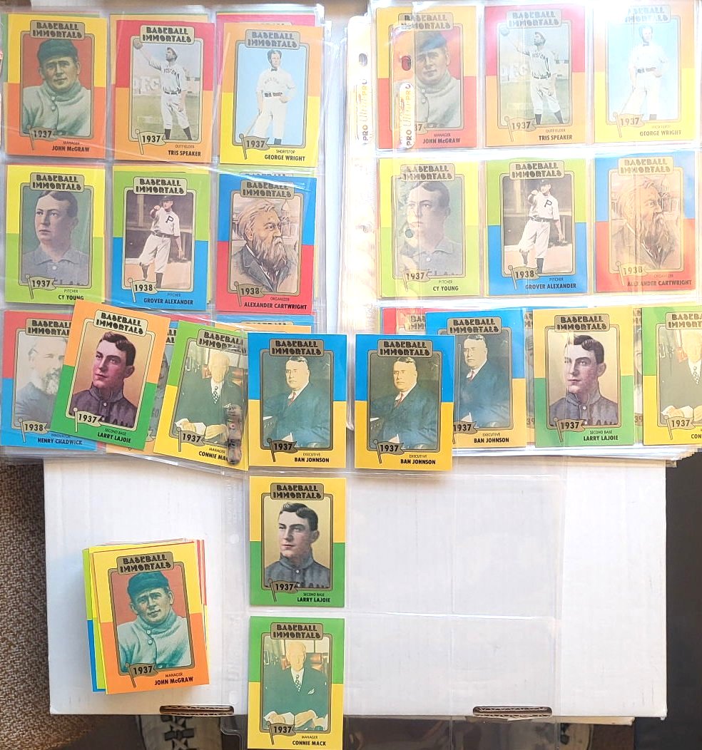
As you can see above, I put them in order by 1st+logo, then 1st only, then neither. So the first paged ones could be put in the first column in the new sheet, then the 1st only's in the second column, and on and on, 3 by 3.
To complicate matters further, there are five of what I'd call "real" variations in the colors used on the front of cards depicting the same player. I mocked some of these up since they don't have images on the database and I don't own them all yet.


That's where I'm going to leave it today. Probably more than you ever wanted to know about this quirky Hall Of Famers set. Anybody else now motivated to fill out the better part of them three times?
Didn't think so. It's just me.....
Welcome to my 700th post.
I calculated a few years ago that my card related posts were about 100 less than the total posts, so this might be 600-ish in the cardboard sense, but it's easier to just watch the Blogger counter.
So I haven't changed much about the layout of the blog for a few years. I added the buttons for COMC and SCF, linked to my latest card room post ("Meanwhile...), and changed around the graphics about rookie card propaganda and my profile. But since I revamped the banner in 2018, and again in late 2019, not much has changed about the overall look.
Now I've gone from this:

To this:

The background (down the sides) is more muted, but cooler looking IMO. It took some tweaking to get it to fill both sides. I actually split the image of the cube and streched the middle out - it's actually black behind the post area. Depending on your screen resolution, you might see beyond the cube (at like 1920 x 1080), but mine is set to 1600 x 900 in this capture. Mobile users won't see much of the sides at all.
I'm also going to fiddle with the side items a little more. Just have to finish editing this post to get back to the layout controls.
Most of the links show up as the visited color - the muted red (which I adjusted to not be so washed out) - on my screen. This offsets the list of other blogs and the Previous Transmissions nicely, but on the actual blog that you guys see, it's a LOT of red text.
What do you think of the (new) look?

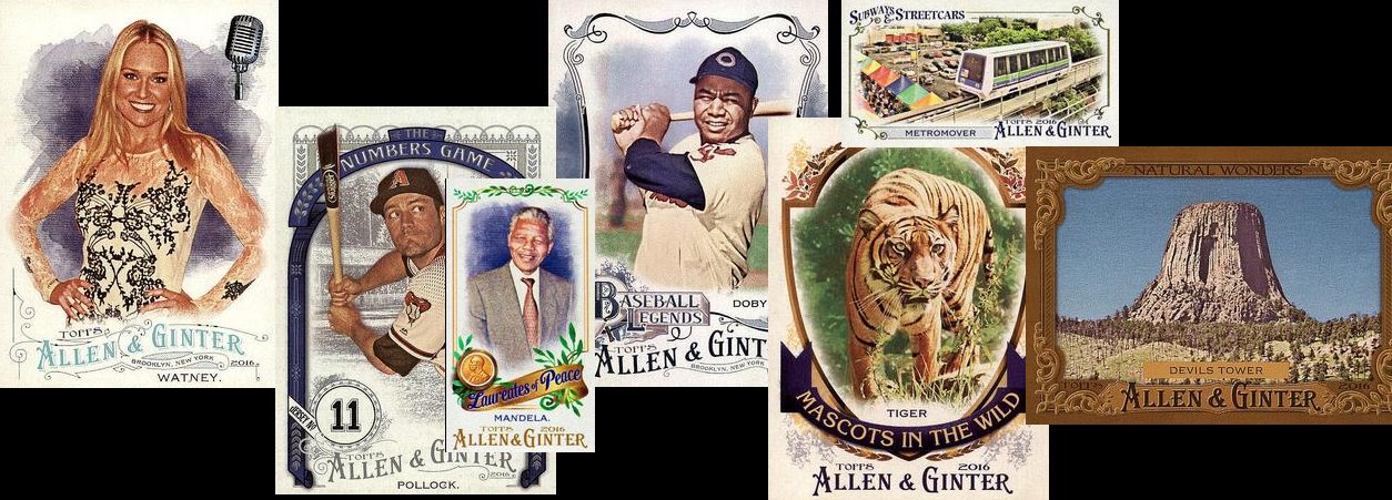
Here's the unmuted background. I tried to put the card images in places that wouldn't be covered up by the titles so much this time. And I used significant images from the last couple years, especially the masked Mantle, the Russian hockey cards, and the custom Hamlin. The Rev'd Up in the top left corner is a rainbow collection, the Grant Jackson rookie was a long hunt that ended well, and the Paige Spiranac is a recent acquisition. I realized last week that I haven't ever finished the Heritage Pairs series that I started in 2020. Would you like to see it continue?
In honor of the milestone post number, I'm going to figure out some sort of giveaway, which I've mentioned before, I think. I have so much stuff I'd like to move and I know certain people can use, but I want to limit - or at least give first dibs - to those of you that have been loyal readers and commenters. The trick is matching you to the right stuff in an efficient manner. Stay tuned....

OK, not quite like that...
I recently upgraded my ability to contribute images to the Trading Card Database as well as this blog and any other endeavors that use images of trading cards.
Before, the normal method was a flatbed scanner, which in my case is the top half of my Canon inkjet printer. Up to about nine cards would be loaded onto the scanner surface face down, covered with a piece of foam to darken the background, and then the lid is set on top.

Then I use my Paint Shop Pro program from 1996. Hit one button and it quickly sweeps the scanner bed and gives you a preview of what you've got set down. Hopefully they stay aligned to the edges of the bed. Then the scan area is designated, the picture mode selected, and the Scan button clicked. A minute or two goes by while you wait for the scan to complete...bzzzzzzzzzzzzzzzzzzzzzzzzz...


So I've contributed a decent number of images to TCDB, but it's not an efficient operation. Until now.
I have seen several videos about Fujitsu scanners and their use for trading cards. Now I don't sell singles on any sites that I need to scan, so I don't upload to services like shown in these clips, but it works for manually putting images on the Database too.
I got the Fujitsu fi7030 scanner. They retail brand new for around $550. I was hoping to find one for much less on a Black Friday deal. No dice. Then I realized that this model has been around a while, so there should be some on eBay! From a quick Google search (initially from any store), I found one on there for just over $300. But a lot of the cheap ones are missing the feeder tray and/or the AC power adapter - and that's a deal breaker. I found one that was complete and tested by the store that was selling it - for just over $275 - but with a Best Offer option. They accepted my $250 offer! So I basically got one for half price! They're about the size of an average fax machine if you're old enough to relate to that.

The images of both front and back are captured for each card as it passes through the machine. Sometimes it flips them around, but that's correctable with a couple clicks.
Then you "release" that batch of scans into the folder you designated, and voilà! Your images are there. For the most part, they are cropped right down to the edges. (I have my scan area set to exactly 2½ by 3½ inches, so there's little margin left.)
You can now go to the database or wherever you need the images and upload them into place. The whole process takes less time than the first page of flatbed scanning typically would! Plus, you can add batches to the ones you just scanned and get hundreds of images in just a few minutes! Unfortunately, this model only really does regular base cards. I tried a thicker jersey card and it wouldn't make it through the feeder. I did confirm with a few junk cards that it doesn't leave marks on cards from the feeder rollers or anything. I might be able to set it to mini size scanning in order to do those. They'd just have to be done separately. The bulk of what I need to do is regular stuff anyway.
Watch out database! Here I come! I bet Database champions like Billy K have something like this...
As you probably know, I'm not one to pay much attention to the hype on modern cards and their exorbitant prices. The stars today don't quite have the mystique or reverance to me that vintage guys do. Which is not to say that there aren't a few players that will be in the record books and lore for a long time to come.
Every once in a while I have to acknowledge that as it manifests itself in cards.
So a couple months ago, I went into my collection...


Of course it's on the bottom...

Writing on the corner of a box is rather difficult. My handwriting is better than this. But anyway...

OK, pull that one out...

Series 1 on the left,... Series 2 next,...hmm don't have wrappers for Update. Oh well...

Ah, bonus SP Ruth! OK, should be about right here...

Pull that chunk out...

Right about here...

There he is!

That's a little better, considering...

Figured I shouldn't leave him in there with the set for much longer. I could put him in one of those big lucite holders with the four screws like I have all my other big money cards. (I know, no one uses those any more.)
Anybody else I might be neglecting in my sets for the last decade or so who is now over $50?
Stole this idea from Night Owl in what would be a great Bat Around. He kept his list limited to Topps flagship sets, though in more than just baseball. Being primarily a set collector, my list is a lot more diverse than that. Not knocking his choices at all - I said I'd probably include 1971 as well and maybe a couple of the others - but I got to 12 or so and there weren't any yet.
I made my list and then had to figure out what order they fall. My analytical mind took over and I came up with a scoring system that breaks down some positive and negative aspects that influence the collectability of a set.
Categories include the fundamentals - Cool base card design, distinctive player photos, original inserts, whether it contains retired players.
I gave points mostly on a 1 to 3 scale, where 1 is weak, 2 is decent and 3 is great or very true for that quality. A couple other categories got either 1 or 0 for true or false. Those included whether it's a retro design, or the design is used for other sports, or if there are variations or parallels that make the set harder to do. I did use half points in some cases. That made it so there weren't as many sets tied with the same score.
Here's the chart (without the set names) for all you stat nerds:

So with that out of the way, let's get into the countdown. I'm starting at the bottom.
16. 2002-03 Pacific Private Stock Reserve Hockey

Base 3 Inserts 1 SPs -2 Rare inserts -1 Total 1
15. 2009 UD Philadelphia football

Base 1.5 Retro 1 Retired 1 Inserts 2 SPs -1.5 Rare Inserts -1 Total 3

Base 1.5 Retired 1 Inserts 1.5 Total 4
13. 2013 Panini Hometown Heroes baseball

Base 2 Retro .5 Retired 1 Inserts 2.5 Parallels -1 No Logos -1 Total 4
12. 1999 E/X Century (football)

Base 3 Inserts 1 Multi-sport 1 Total 5
11. 2002 UD 40-Man baseball / XL football

Base 3 Photos 1 Inserts .5 Multi-sport 1 Rare inserts -.5 Total 5
10. 2002 Topps 205

Base 2 Retro 1 Photos 2 Retired 2 Inserts 1.5 SPs -2 Rare inserts -2
Variations 1 Total 5.5

Base 3 Photos 3 Retired 3 Inserts 1 SPs -2 Rare Inserts -2 Total 6
8. 2004 UD Legends Timeless Teams

Base 2 Photos 3 Retired 2 Total 7
5. 2016 6. 2018 7. 2014 Allen & Ginter


OK, so I knew A&G was gonna show up on this list somehow. I just had to analyze all my favorite ones and see who came out on top. (And I decided to put them all in so I wouldn't have a total of 13 sets.)
All five A&G sets (these three and '19 & '20) all score relatively the same, except for a few details. 2018 is my least favorite base design but had better inserts than the other two, while 2014 had a short print insert for about every one (the ones that came with the binders), so those points kind of offset. The more mini inserts I liked, the better the score. Most that weren't the usual animal or geological feature tallied points. So the totals of all three only differ by a ½, but distributed a bit different. That's why they're all together here. And A&G short prints aren't a big deal, so they only got half the penalty point.
Base 2/2/1 Retro 1 Photos 2 Retired 2 Inserts 2.5/2.5/1.5 SPs -.5
Total 8/8/7.5

Base 2.5 Photos 2 Retired 3 Photos 3 Rare inserts -2 Total 8.5
3. 1997 Upper Deck Legends football

Base 3 Photos 3 Retired 3 Total 9
1. 2020 & 2. 2019 Allen & Ginter


Base 3/2.5 Retro 1 Photos 2 Retired 2 Inserts 3 SPs -.5 Total 10.5/10
And that's my list.
How many of these sets have you never seen before?
How many did you collect too?
Any of them your least favorites? OK, maybe don't answer that one... :)
Let me know what you think. And do your own lists - make it a true Bat Around!