Friday, February 25, 2022

A Diverse Portfolio

Just a quick "look what I got" trade post.  Made a trade with a member of the trading group I've been part of the longest.  Mr. William McCaleb sent me this congregation of cardboard that was the most diverse I've received in a good while.  It hit several obscure parts of my collection - a couple of which hadn't changed in a while and a new one that I started with this delivery.

2013 Allen & Ginter Ripken insert - Ginter inserts will be on my wants until I stop collecting or they stop making A&G.  

2009 Topps Mayo Pedroia & 2009 Topps Heritage Lowe SP - these are both from the same set.  Dustin is the last of the Mayo inserts that are "numbered" with "TME" (the Target versions).  I need all ten of the "WME" (Wal-Mart) versions.

More Ginter - this time 2012 Short Prints.  They will stay on my lists longer than the inserts I'm sure.  But at least they're not as hard or expensive to get as Heritage SPs.

Speaking of Heritage again, these are the first 2021 Heritage I own, and I only want two more - the WS highlights with Vida Blue and Gene Tenace.  These are for player collections (and the Space binder.)

Now it's gonna get weird - Golden Age mini Baseball Caramels Red and Carolina Brights green versions.  Scanning was easy because I had an extra Caramels blue one so I got the front while showing the new back versions all at the same time.  Surprised me that the red one is the first of my player collection guys I have in this color.  Still looking for Fisk, Keith Hernandez and Apollo 11 in the crimson, as well as others of those.

A 1999 SP Top Prospects of one Michael Jordan in a Birmingham Barons uniform with a bat!  This is one of five Retrospectives of Jordan that make up half of the insert set.  The first five are Ken Griffey Jr. with the San Bernadino Spirit.

Now we're over the top.  From the 1993 Marvel Skybox series, these two Red Mirror Finish inserts cut my want list in half.  Just Need Spider-Man 2099 and "The Specialist" to take these out.  Toughest part is going to be finding where I've put this set box.

And finally, if you've just started watching the NBC series "The Endgame", you know who this is.  The lovely Morena Baccarin graces this "Women of Serenity" diecut.  She played Inara Serra in the sci-fi series Firefly (and the movie Serenity).  This kicks off another non-sport mini collection of her which really only contains a few other cards.  She was also in Stargate SG1 and Gotham, but most of those cards are autographs that go for about $300 if you can find them. 

Thanks to Mr. McCaleb for a great trade!
Tuesday, February 22, 2022

Football For Trade: LIst 1

Starting off with the vintage listings.  These are generally in OK condition, but not really minty until you get to the 80's.  Then they should be fine for everyone.  

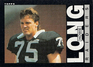
Again, these are just the big batches.  No huge stars, mojo hits, or iconic rookies. Mostly base commons and some veteran stars.  The pictures are cards that should be in the boxes, but aren't the exact card.  (Just less work that way). 

Counts are estimates - measured by size of stack.

1971 Topps - 175 cards (mostly VGish)

1973 Topps - 150 cards

1974 Topps - 100 cards

1981 Topps - 75 cards


1982 Topps - 250 cards

1983 Topps - 100 cards

1984 Topps - 260 cards (also have 2nd set minus < 10)

1985 Topps - 100 cards


1988 Topps - 75 cards


1989 Topps - 125 cards


Sunday, February 20, 2022

Football Season Ends - Card Trades Have Just Begun!

I finally sorted out all nine monster boxes of football cards from the hoard I bought just before pandemic time.  (The other half was baseball that I distributed back here.)  I messed up and didn't take picures while I was sorting all this, so you didn't get a post about that.  But now it's time for trading!  Hopefully the fever for the sport hasn't diminished since the Super Bowl ended.


Since I integrated all the extras into what I already had, my range of cards goes from the 70's to 2018 or so.  After about 2005, there are big chunks of certain sets.  A lot of these are rookie centric, like Contenders, Press Pass, Donruss Elite etc.  But there are a lot of other great sets like Prestige, Score, Topps, and even things that I don't normally delve into (like the rookie stuff), and Bowman and Topps Chrome in select years.  


I'm only listing batches of a product if they exceed 75 cards.  I have many other cards from products not listed here, so don't hesitate to ask if you are working on something similar that you don't see.  They're just smaller quantities.  I also may occasionally have inserts, rookies, or parallels for even the smaller batches as well.  I won't have any huge rookies, GU or autos, Ravens, or Tom Bradys, as that's what the previous owner kept for himself.  Though I did find a $20 Cooper Kupp and some Patrick Mahomes base cards that list for several bucks on COMC while I was digging through.


If you see things you need, either comment or email me and we can trade.  I am not worried about matching values or quantites at all.  Ideally, I'll send you several hundred cards and you send me a good handful.  That way, I get things off my want lists, and move out some of this volume.  

Team collectors are also welcome, especially if you have a website or comprehensive list of what you lack for your team.   

I can also sell starter lots if you desire.  They will generally be about 10¢ a base card or so, probably a little less.

The next several posts will list sets and quantities of what I have available, starting with the box above - the vintage years into the early 90's.  I know no one wants to see any 1990 Pro Set or '91 Score, so I'll bypass the junky stuff for the most part.  And as I mentioned, the listings will be only those products that I have more than 75 cards or so.  As you can see in the pictures, there are little clumps of about everything in between as well.  And every now and then a huge run of something wacky like the 1992 All-World in the above image.

So stay tuned for those listings, and send me your football want list links!


Sunday, February 13, 2022

Stumbling On A Cure?

Since prices are through the roof for just about anything but dime box fodder, this may apply to a slightly larger audience these days.  It's going to take some more experimentation, but I might have found something that works to cure a problem that occurs with bulk commons, and that is Bricking.  Chunks of cards that are stuck together from being stored in damp environments that interact with the waxy coating.  With some more modern card finishes, you can snap them apart and they stay intact, but with others (I'm looking at you 2003 Topps), they tear little spots and come out speckled.  I wrote about this before in this post.

Recently, I bought a group of small extension sets to a junk wax football product.  They were all still neatly shrink wrapped, but when I opened them, they were stuck together.  Not completely, but it took some effort to get certain ones apart.  Long story short, I had an idea about another method to separate these cards. 

I got a new humidifier for Christmas this past year.  It's one of those that constantly puts out a large plume of mist into the air.  Looks like this:

Figuring moisture that dries is what sticks cards together, why wouldn't moisture reverse the process?

So I held the stuck cards over the mist stream, while pushing them gently apart so the mist could go between them.  

Not my best photographic work

After about 10 or 15 seconds, the cards seemed to come apart a lot easier.  They kinda separated on their own.  And they came out cleaner than the ones I pulled apart manually.  I made sure to wipe the water droplets off the cards when I removed them from the mist.

One disclaimer ~ the group I used the humidifier on was also in the freezer for about an hour or two.  Not sure if that contributed.  They didn't come apart immediately after removal from the freezer, so I don't think that helped much.  I've heard about other people trying that with mixed results. 

The card on the left was just manually pulled apart.  The one on the right got the mist treatment.  There are a lot less speckles on it.  Again, there are other variables at work here, like if they were all exposed to the exact same environment, position in the original package, etc.

Fortunately, I came out with two reasonably intact sets of these particular cards, which is all I needed.  If I had tried the humidifier trick on more of them, I may have ended up with less speckling on a lot of them.  But I hadn't thought of it until I had unwrapped almost the whole batch.

If you have a similar humidifier and come across some bricked cards, try this method and report back your results.


Wednesday, February 02, 2022

WFT Rebrand: Texas Did This Better Too

As a lifelong Washington football fan, I'm rather obligated to put up my take on the new name and uniforms revealed today.  Being a fan of the team is a tough job.  There are a few NFL followings that are tougher, but not many.  And it didn't get a whole lot easier today.

The Commanders isn't horrible on it's own, but it does lend itself to perversion into "Commies" (to become the Patriots natural rivals instead of the Cowboys?)  It would have been worse with the "Red Tails" tribute to the WWII fighter pilots (of another geographical area) which I'm sure would have been what Dallas fans would call us after "they just done whipped those tails."

The circular logo is the nicest, though it was pointed out that the championship year is not the year that the Super Bowl game was played, but the previous year's season.

The folded W is a slight downgrade in my opinion.  My first thought was that it is a stylized version of the list of charges that Snyder is about to receive in the Congressional hearings that are coming up soon.


The uniforms are surprisingly bland.  I expected a fancier design, especially with the gradients and embroidered stars that were teased before the reveal.  The stars actually appear inside the jersey collar - where you can't see them - brilliant.  There are no stripes down the sides of any of the three ensembles, so it's like Color Rush every week.  And the wordmark is huge on the regular home jerseys.  Wouldn't mind that as much, but the font is really generic and doesn't quite inspire the military flavor that the containing stripes are also supposed to suggest.  The number fonts aren't bad, there are worse around the league.  I think I like the black uni's scheme the best, even though it's still a bit spartan and was created to follow a fad that has probably passed.  Hopefully these will all evolve in the next few years.

This isn't the first we've seen of this name in this decade.  The San Antonio franchise of the Alliance of American Football was also the Commanders.  And they executed it very well.  Every team in that league had deep meaning to their community.  This team even played in the Alamo Dome.  The Alamo appears in the logo along with a Lone Star and a sword.  The burgundy and red color scheme works rather well, I think. 

Blended with the right amount of white, it's a very distinctive look.  The nameplates and numbers on the helmets (one side) are a nice touch.

The helmets were their best feature.  Two colors, the side numbers matched by the regular logo on the other side, plus the subtle Alamo in the back with the city initials.  

I guess I like Riddell's style a lot more than Nike's.  You can already see what could have been a much better executed Washington design has already been a victim of Nikefication from the jump.

And once again, the Texas people come out ahead...


Oh and there is this one other curious fact - remember what the Bidens welcomed around Christmas time?