I noticed an oddity back on May 22 when I went to the Chantilly show. I stopped by Uncle Dick's tables and found some upgrades to my 1974 Topps football set (among other things like 1957 Topps baseball from the bargain bin and several other base cards from different sets.)
(Uncle Dick said he was retiring, but he was there again helping the new owner out, wearing his flourescent green jacket and matching sneakers. The guy is one of the all time legends)
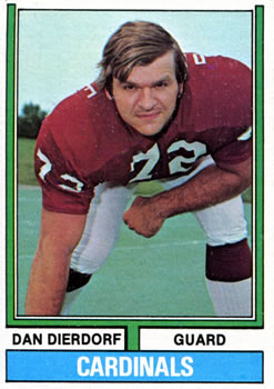
Anyway, one of the cards I got was #32 Dan Dierdorf, the former offensive lineman for St. Louis, and broadcaster for Monday Night Football.
The weird thing is the team name in the blue strip across the bottom. It's not a variation, but it is different from every other Cardinals card in the set.
For some reason, Dierdorf's card has a narrow team name. Every other card in '74 Topps football has the same blockier font. I never noticed it before. It's bizarre.
I'm gonna have to page through my set to see if there are any other mutant team labels now. And my OCD is irrevocably tweaked by this. It was already down a few points because of the Parker Brothers game variations in the set. And now this...?
And just for fun, a Monday Night Football promo from back when the Washington franchise played well enough to make the highlights - a lot!


You've gotta be a legend (in any profession) to pull off the flourescent green jacket and shoes combo.
ReplyDeleteInteresting catch. I went through my '74s, I have maybe 3/4 of the set. I didn't see any font variations quite that big. I did notice on #145 Reggie Rucker, however, that the Patriots name is a little right of center, a couple of millimeters off from other Patriot cards.
ReplyDeleteI am very glad that things like this don't bother me :)
ReplyDelete