Welcome to my only annual new product opening! Now and then I might jump into Heritage or Stadium Club, but Allen & Ginter is by far the most consistent purchase that I'll make year to year. Of course, that no longer includes flagship.
Took me a bit to decide how many boxes I wanted. I like the design this year, but it's not my favorite, and the inserts were decent, but not quite as exciting as some previous years. I settled on three boxes, and sent for them the day after they came out. Consequently, I think I paid an extra $10 a box. But anyway, let me know if you think I got my money's worth.
We'll start with the box topper, and then open the top pack on each stack from left to right.
A Diamondback to start. Not encouraging, though I do recognize this guy from Heritage. Can't tell you much after that.
First pack - A "scratch rub-and-sniff" mini (these really work!), a Star of the (Westminster Dog) Show, and four base cards. A mix of non-sport and baseball players that is a big part of the appeal of this set.
You may have noticed something different about these base cards.
Yep, they're the shiny Silver Hot Box Parallels. This whole first box is this flavor of semi-shiny. I'm glad the design has some color and structure. It contrasts with the frame well, so these are pretty decent looking. But it gets me thinking - this is part of a trend that I'm not a big fan of. The Shiny is taking over.
More on that in a bit. First hit now - Nice Johan Rojas mini framed auto. These are really distinguished looking. The border is a bit ornate, but it goes well with the card design. I won't be going for the whole run, however. There are a couple of my player collection guys in the checklist, though not as many as previous years. The biggest chase of this year's A&G for me is the new quarterback phenom in Washington, Jayden Daniels.
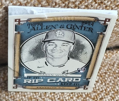
Next hit! (All three hits came side by side by side in all three boxes. About halfway down the stacks.) Numbered out of 199. Do I rip it or keep it? Pffft. As if I could ever go very long without finding out what is inside. I developed a method of opening these neatly without shredding the outer card a few years ago - see it here. Let's see if I can execute it well again.
High number Cubs guy. Hmph, OK. But there is one slight problem....
Hacked it a little deep on the extraction. Split the lower ¼ of the mini. Sealed it with a bit of glue, but it'll be a throw-in to whoever wants it. So much for my fancy technique.
A few slip-throughs, but the outer card is reasonably intact. Will look OK in a top loader or binder page. Will alter my technique the next time I get an opportunity.
The mini inserts for this box. Rather basic, really, except for the Got The Itch's, which are really cool and do provide the sensory experience of the smells depicted. Those are probably the only ones I'll pursue.
I did some research on every A&G insert so far, to see how many times they repeated topics. Flags have now been done three times - Mini Flags, Flags Of The World, and Flags of Lost Nations. One of seven categories that has been used thrice. Dogs are another (which I'll excuse). The whole list is huge, and I'm not sure how to present it in a meaningful but not massively verbose way. Let me know below your thoughts and level of interest.
The player minis - first two columns are regulars, the third is the A&G backs, with two black borders and a Chrome. Again, more shiny creeping into the main components of this set. I will say they do look nice, but a modern shiny finish on an antique themed set is really contradictory in my opinion. Doing it in Heritage is bad enough, and those are just from 50's and forward, as opposed to the 1800's.
These are the bulk of the trade bait that I use from Ginter....they are all available. Once I get close to finishing the 2012 Gypsy Queen black minis, I may jump into an A&G design at some point. It will have to be a new design - trying to go back and start an old one would be futile, I'm sure.
I like the full-sized inserts, especially the doggies. The Sister cities is cool, but I'd love to find out what makes two cities decide to bond like this. Guess I could Google it. I expected the Buzzin's to be minis, but they're nice full size. Collation was great on all these throughout the three box breaks.
These are the coolest inserts in the set this year and maybe in the last several, if not of all time. "X-Ray'd" images of Oregon Zoo animals are printed on high-gloss stock like real X-rays. My pictures don't do these justice. And the brand labeling is very subtle. The back text is a little small for my taste - at first glance I thought the bullfrog (lower right) said Bulldog. Image made sense for either one. 😄
The extra-shiny base from this all-shiny package. Each box had three regular Chromes and one refractor. Some good names here, though I defaulted to Boomer Wells the pitcher from '87 to '07 and not this dude.
You might be wondering how to distinguish the Hot Box silvers from the Chromes. I got Clayton in both, so he can show us the difference:
The silver Hot Box ones give more of a rainbow reflection, but don't have much of a mirror finish.
The Chromes are not as prismic, but you can see yourself in the borders. There are no Chrome logos on the front or back of the cards.
The fourth flavor of shininess is the Silver Filigree. I got lucky and got one of my main PC guys in that and a mini as well. You can see the ornate decoration in the border of these.
In what turns out to be the third hit in this box, I also got an Orange refractor numbered to 25 of the "other" Bo. The color blends very nicely with the frame and interior.
So we're a third of the way through. Thanks for slogging through until the end, I know it's a lot of images.
In closing, I'll sum up by saying I don't regret collecting this set. But I can see the end of the road if things keep trending the way they seem to be going. If A&G creativity wanes and is replaced by multiple forms of shiny parallels, I'll drop Ginter like I did flagship. It feels like that will take a long time to happen, so I'm not worried yet, but this hobby caters to the easier things rather than the creative and innovative that take more work to produce.
Do you prefer shiny baseball players, or more variety of subjects and inserts to make Allen & Ginter the set that it is?


I typically do like the shiny cards, but they do seem a little bit off on the A&G cards.
ReplyDeleteThose x-ray cards are really cool by the way.
Sigh ... Shiny is so out-of-character with A&G and now we have to take on that task of telling the difference between different shinies like it's a Chrome product? What have you done, Topps?
ReplyDeleteDon't like the design at all this year. ... I would be interested in a list of reused A&G themes as I've been wondering that myself.
Those hot boxes only come 1 per case, so you did good there with just three boxes.
ReplyDeleteI really want some of the xray cards and the scratch and sniffs.
ReplyDeleteThe boy meets world base, autos are right up there as well as a need.
A. The Scratch and Sniff inserts are really cool. Reminds me of collecting the scratch and sniff stickers as a kid.
ReplyDeleteB. If nobody is interested in the Imanaga mini... I could give it a warm home in my damaged card pc.
Dangit I just sent you an envelope....
Delete