Since there are a ton of posts about Topps' new release, I'll make this quick and efficient.
Base set - Great photos. Fun shots that aren't overprocessed like 2009 and 10 looked to me. Numbers are clear and easy to sort.
Parallels - Not real impressed with the golds. Haven't seen the retail ones yet.
GUs, SPs and giveaways - As usual, didn't pull anyone impressive. See inserts rant below. I don't expect to see any of the SPs. Curious to see what comes up for all my codes this time.
Inserts - Topps has (re?)hired the Panini football design team and they are still lazy bastards. What they came up with are auto jersey cards and then just removed the good stuff to make the regular insert. Each insert looks like a football card from Panini's past. To wit:
 |
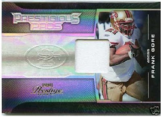
| Not bad, but why is there still a space for an autograph? |
 |
| Look familiar? Sorry, no autograph for you!! |
|
|
|
 |
| Plain |
 |
| Auto |
 |
| Relic |
 |
| Plain (though crummy Chromey) |
 |
| Auto |
 |
| Relic (in a crappy location) |
Only difference is that it seems the 2012 baseball guys are either relics or autos, not both.
 |
| Nice design, but it's not finished. |
 |
This one has the gall to put it in writing that you got
gypped out of an autograph. Kinda rubs it in your face. |
|
 |
| Now what they should have done with this.... |
 |
| ...Is finish the coloring. Now that's not a bad looking card. |
 |
This is the most hideous design of all - redundant pictures that you
can see, and a different one that's faded for no reason.
Huge blank areas, and a dinky logo that doesn't fill the space.
Plus, silver foil on grey? Eccch. |
|
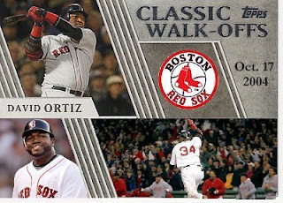 |
| Now that would have been better. No gaping holes. |
Worst part about the whole thing is that I'm still going to go after all of them except the Walkoffs.


I really hate Panini anything and Topps' emulation of them just draws more attention to that craptastic company.
ReplyDeleteYour site has now been added to the Sports Card Blogroll.
ReplyDeleteSincerely,
JayBee Anama
bdj610
Much better!
ReplyDeleteThat walkoff is much much better. Should have done what you did or put an auto there.
ReplyDelete