Showing posts with label photoshopping. Show all posts

Monday, February 03, 2025

Ginter Gap Cards #4

The fourth installment of Ginter Gap cards - custom A&G cards with subjects that Topps didn't include - uses the 2024 design.  


It's unfortunate that this tribute comes at the time of Bob Uecker's passing.  I won't go into his career and biography, since almost everyone that knows baseball knows who he is.  Just check out some of his appearances on the Tonight Show with Johnny Carson via YouTube if you want a good laugh.

I took a bit of a liberty and moved the Topps name from between the subject name and the A&G wordmark.  It seemed so crammed in there.  

This picture is somewhat more square, so there's a lot of headroom (and background to fill in when I removed the player that was in the original template image.)

You can see that Kirby is shown from halfway to his beltline, while Uecker's image stops just below the collar.  It didn't take me nearly as long as it typically does to create the framework and then integrate the image in it.  

I actually started with the name.  I moved the "U" on top of the "P" and then copied the "E" into the space that was created.  That gave me "UECKE", so I just had to find an "R".  It came from Gunnar Henderson.  That "R" was out in the middle of a bright background of the same color, so it pasted right in.

Then all that was left was to adjust and fill in the background around him.  And paste over the side "rails" where the image covered them, or extend the blue areas of his jacket to meet the side edges.  And voilà!

Tuesday, October 17, 2023

Ginter Gap Cards #3: Had To Do It

I was hoping to whip this up in a couple hours tonight just so I could break up the last two A&G box posts.  But image editing with a program from 1992 just takes a lot of time.  Plus I was starting from scratch since this subject has to be in the 2023 Ginter design instead of last year's, which I already had the templates made up for.

From what I've (briefly) read, the most popular couple nickname for Travis Kelce & Taylor Swift is "Traylor".  But that was just one article.  I kinda like mine - pronounced "tray kay and tay tay".  

Now I'm a metal head from the 80's so I'll never consider myself a Swiftie at any point.  I don't know a lot of her songs, but she's geniunely and extremely adorable.  Kelce seems like a bit of a frat boy, but he's goofy too, so I wish them well.  There are hardly any good shots of the two of them together yet, so I had to fake it with these two images.  Does it look legit?

This 2023 design is tough to piece together.  I took Max Scherzer's card (since he had the nice light colors) and eliminated his picture.  Then I extended the upper background all the way across to make it easy to paste on top of it.  But then I realized I had to separate the bottom half and make that so it would paste on top of the photo.  Took some liberties with the edges, so they differ from the original.  The name section is a bit narrow, but I'm rolling with it.

One of these days I'll learn PhotoShop for real and be able to manipulate layers much better and also make the photos look more like drawings so they blend better.

Tuesday, September 19, 2023

Ginter Gap Cards #2

The half dozen people that responded favorably to my custom A&G cards of Malika Andrews inspired me to create some more.  I'll call them Ginter Gap cards, since they are subjects that Ginter didn't include.

This time, it's the new owner of the Washington Commanders.  He's already brought good fortune on the franchise - they're 2 and 0 on the season so far.  There are also reports that a new stadium is in the works.  Not to mention that he replaced the dark cloud over the team in general.

Guess I could have waited a few days for the new 2023 A&G to come out, but so far I like this base design a whole lot better.

Friday, January 20, 2023

Tweaking The Look & Tallying 700

Welcome to my 700th post. 

I calculated a few years ago that my card related posts were about 100 less than the total posts, so this might be 600-ish in the cardboard sense, but it's easier to just watch the Blogger counter.

So I haven't changed much about the layout of the blog for a few years.  I added the buttons for COMC and SCF, linked to my latest card room post ("Meanwhile...), and changed around the graphics about rookie card propaganda and my profile.  But since I revamped the banner in 2018, and again in late 2019, not much has changed about the overall look.

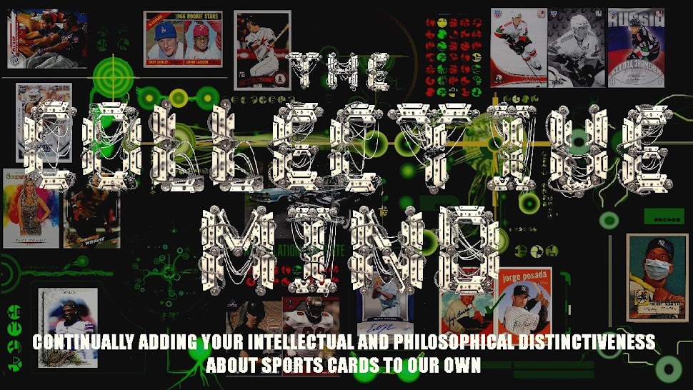
Now I've gone from this:

To this:

The background (down the sides) is more muted, but cooler looking IMO.  It took some tweaking to get it to fill both sides.  I actually split the image of the cube and streched the middle out - it's actually black behind the post area.  Depending on your screen resolution, you might see beyond the cube (at like 1920 x 1080), but mine is set to 1600 x 900 in this capture.  Mobile users won't see much of the sides at all.

I'm also going to fiddle with the side items a little more.  Just have to finish editing this post to get back to the layout controls.  

Most of the links show up as the visited color - the muted red (which I adjusted to not be so washed out) - on my screen.  This offsets the list of other blogs and the Previous Transmissions nicely, but on the actual blog that you guys see, it's a LOT of red text. 

What do you think of the (new) look?

Here's the unmuted background.  I tried to put the card images in places that wouldn't be covered up by the titles so much this time.  And I used significant images from the last couple years, especially the masked Mantle, the Russian hockey cards, and the custom Hamlin.  The Rev'd Up in the top left corner is a rainbow collection, the Grant Jackson rookie was a long hunt that ended well, and the Paige Spiranac is a recent acquisition.  I realized last week that I haven't ever finished the Heritage Pairs series that I started in 2020.  Would you like to see it continue?

In honor of the milestone post number, I'm going to figure out some sort of giveaway, which I've mentioned before, I think.  I have so much stuff I'd like to move and I know certain people can use, but I want to limit - or at least give first dibs - to those of you that have been loyal readers and commenters.  The trick is matching you to the right stuff in an efficient manner.  Stay tuned....

Saturday, January 07, 2023

Ginter Gap Cards #1

The half dozen people that responded favorably to my custom A&G cards of Malika Andrews inspired me to create some more.  I'll call them Ginter Gap cards, since they are subjects that Ginter didn't include.

Today's subject is a guy that's on a lot of people's minds.  

So great to hear he's awake, and talking without the breathing tube and looks to be heading toward a full recovery.  A remarkable story.

Monday, December 12, 2022

Another Nice Ms. Andrews

Allen & Ginter typically features a variety of celebrities, sportscasters, musicians, athletes from other sports, and even objects to go along with the current and retired baseball players.  And several of their subjects are usually women, and deservedly so.  

Especially appreciated are the really attractive ones.  I usually designate a "Babe Of The Set" each year and sometimes will go after the minis and parallels.  Started that with Erin Andrews and Mrs. Verlander, Kate Upton.  They are so popular that I've not found too many and have only done a few others, including Paige Spiranac, who has some cards in other sets like Upper Deck Goodwin Champions that are even better shots than the usually conservative A&G.

This year's candidate is Malika Andrews.  She's the former sideline reporter for the NBA on ESPN who now hosts the NBA flagship show on the channel.  Her card is #258 in this year's set.

Not bad, but again, the conservative image.  She's got such a bright smile that this shot doesn't quite bring out with the impact it should. 

So I made some custom alternatives.

Now, my image editing program has been around as long as the WNBA, so I don't have the tools to match the painting-like images on Allen & Ginter cards, but I tried to mimic the faded backgrounds as well as I could. 

That's better, but the background was so bright that it looks like she's in a lava lamp.

This one's cute, and is really close to the actual card image.  Much better smile though.

I like this one the best.  She doesn't wear her hair down too often any more (at least in the few times I've caught the NBA show, which is almost never.)  But this one captures her the best IMO. 

Which one do you like?

Thursday, April 01, 2021

Online Addition to 2021 Topps Series 1

Well, I guess seven insert sets of the same repetitive reprints or rehashes of old designs just wasn't enough.  Now Topps has come out with more recycling as online exclusives.  Just saw this:

Not really a reprint, but a stamped buyback of a 1984 insert.  Commemorating nothing in particular, it comes with a special 70th anniversary price.  

Is it special shiny technology?  No.

Autograph or game-used relic?  Nope.

Exclusive serial numbered version?  Sorry.

It's just a buyback like the ones in 2014, 2015, 2016, and 2017.  A repeat of something Topps has done several times before, even though they only celebrate anniversaries every ten years or so.  (Well unless you count the 35th anniversary tributes in the last few flagship sets, which are different than Archives, which uses old designs a few at a time, which in turn is different than Heritage which uses the next old design each year.)


Tuesday, March 16, 2021

Lead, Follow, Or Drop The Exclusive Contract

 Maybe I'm just old school, but this is a League Leader card:

In the next decade, they were similar...

And in the 80's...

Not sure what happened in the 90's.  They kinda went away.  Then in 2000, they did this:

OK, not bad.  Change it up a little.  Somewhere they quit featuring pitching victories.  But then we got back to normal.

And swung around to horizontal again...

Now they called 'em "Wins".  Continued on til 2016...

Then this happened.


The card on the right is not a League Leader card.  It's just like the one on the left with an extra title.


Same thing in 2018.  Single player base card with a small text addition.  (The white border is just bad cropping on my part.)


OK, now you're not even using different shots.  Whiskey Tango Foxtrot Over.

Skip forward to this year.  Same deal.  

The windup, quick tilt of the camera, the pitch...and an even SMALLER "League Leader" tag.

C'mon Topps.  Go back to something like this.  I put this together in a couple hours.


Oh yeah, and - extra bonus - you can read the text from more than a foot away!

Monday, August 10, 2020

BBA: 2021 Topps - Make It Better

 I think most of the world would like to leave out the "Topps" in my title and write a re-do to the entire year of 2020.  For now, we'll go with a tweak of the future flagship design as originated by Cards That Never Were.

I've got a few versions to throw at you, but this is the closest to the final product.  The original is just too busy, or I'm too old.  I don't need all the junk protruding into the image and covering it up in spots all over the place.

Let's see the original to compare.

The name is WAY too small.  Shades of the last few years of Topps football when they were seemingly trying to find the smallest font size tolerable.  And those bars on the lower left.  What are they for?  Nothing.

I shortened them up, cleaned them up and gave the rookie logo somewhere to anchor to instead of flotaing free in the corner.  And separated the position over to the other bar.

Replaced the honeycomb from 1987 Donruss behind the middle with the 70th Anniversary of Whatever Facet of Cards This Year across there.  It could almost stand to squeeze the picture at the waist and widen the area for the logo so you could at least see it fully.

Skootched the team logo to the center of the bar a bit too.

I kinda like this typeface for the name better on the light colored bar, but it doesn't work for the position - needs to be bolder and more opaque over there.  You can see that I had the position and variable rookie logo swapped originally.  Figured the empty frame is better for the RC logo since it's only on 50 or 60 percent of the base cards.  (OK, I know, I'm being cynical).

An earlier, and slightly more generic name font.  The lowest blue stripe has been left unfinished.

This is what it looks like when you duplicate the logo before fading effects.

None of these are my final version.  They're all still unbalanced.  Something needs to go in the upper area, but I don't know what.  And it would be interesting to try and make some other players to see how their names fit.  Adell's is really short.

But that's my take on it.  I'm not expecting to see much of these in real life here at the Collective.  Waiting for Allen & Ginter to supplant my annual flagship build.

Thursday, June 18, 2020

2008 Heritage custom

I'm starting a new mini-series that will compare the original 1959 Topps set to it's Heritage counterpart in 2008.  I was going to tackle the 1971/2020 pairings, and while I have the whole set of '71 Topps, I'm not quite done with Heritage.  So I figured I do have both of the '08 combination, so let's see how they match up.

Well, card number 1 was Strike 1 right away.  I guess Topps didn't want to shell out cash to use the images of MLB executives (or managers for that matter - there aren't any) in Heritage, so card #1 is Vlad Guerrero.  No offense to Vladdy, but here's what Heritage #1 should have looked like:


Remember, this is 12 years ago, so Manfred wasn't the Commish yet.  It was an easy transformation from the original Commish card.  Found a font that pretty much matched, and then just had to remove the photo, extend the background and paste in the new picture.


Stay tuned for the Heritage pairups/mismatches posts!

Saturday, May 16, 2020

2020 Topps Opening Day Relic Custom

Having a tough time coming up with post ideas.  I spent a whole evening doing an analysis of my want lists.  Broke them down into Flagship, Heritage, A&G and sets that needed base only, base & inserts, inserts & shortprints, etc.  Had my whole baseball wants page listed out and counted.  And then I realized there was no real significant point to any of it.  Didn't delete it, but I won't use it either.

So I managed to come up with this in the last couple days.  Stayed up way too late and should have gone downstairs for a snack about an hour in.  Instead, I killed three hours last night and went to bed exhausted.  I've been tired lately, and have only been sitting at this desk doing phone support all week except yesterday when I made my regular Friday visit to our shop to actually fix machines.

Anyhow, here's a more realistic Opening Day relic than those that have already been released in the real world...


Let's hope this all ends in time to even play at all, and for someone to be able to watch in person. 

In the meantime, be safe and be well. 

And to the protestors who are whining about being bored so the states should open everything right away - go to one of the major cities and help them move the bodies...

Monday, September 23, 2019

Leading Ladies Of Sports Broadcasting #U1

Special bonus addition to the Leading Ladies set.  This little hottie just started on DC Sports Live on NBCSports Washington.  They revamped the cast with two other dudes I've never seen before and the lovely Miss Alexa Shaw.


She's got a really nice website (Editor's note: website isn't there any more) that profiles her career and more.  Starting as an intern at Fox Sports Southwest while attending TCU, she moved up to sideline reporter for Texas high school football games, and later reported courtside for the WNBA Dallas Wings (2018 & 2019).


This past July she moved to DC and was hired for the DC Sports Live show with Nick Ashooh and Wes Hall, who came from the NBA Wizards Outsiders show, which explains why I don't know them.


It's a lively show with lots of personality, which Alexa fits quite well.  She's got a killer smile and keeps right up with the boys.  She's a petitie little thing, but has a big presence onscreen.


Her smile and style were too irresistable, so I had to add her to the Ladies' series, if only as an update issue.