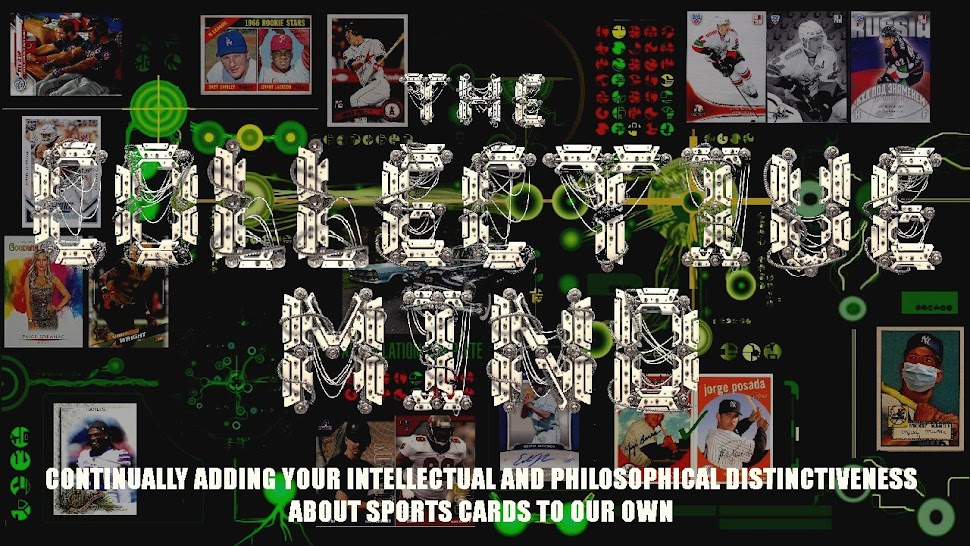
The title is going to change into a more Borg-ian image when I get a chance to muck something together.
The colors are still evolving. [Update: I've changed it a few times today already.] I want dark and sinister but readable, and still have the photos stand out.
At least I have the "older posts", blogroll, and link functions.
Let me know how it looks on your devices.
Check back all week to see the evolution.


I like where you're going with the design/layout. Can't wait to see how it all looks together when you're done!
ReplyDelete