Welcome to my 700th post.
I calculated a few years ago that my card related posts were about 100 less than the total posts, so this might be 600-ish in the cardboard sense, but it's easier to just watch the Blogger counter.
So I haven't changed much about the layout of the blog for a few years. I added the buttons for COMC and SCF, linked to my latest card room post ("Meanwhile...), and changed around the graphics about rookie card propaganda and my profile. But since I revamped the banner in 2018, and again in late 2019, not much has changed about the overall look.
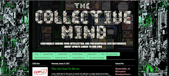
Now I've gone from this:
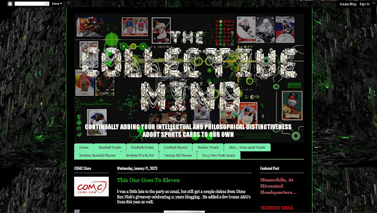
To this:
The background (down the sides) is more muted, but cooler looking IMO. It took some tweaking to get it to fill both sides. I actually split the image of the cube and streched the middle out - it's actually black behind the post area. Depending on your screen resolution, you might see beyond the cube (at like 1920 x 1080), but mine is set to 1600 x 900 in this capture. Mobile users won't see much of the sides at all.
I'm also going to fiddle with the side items a little more. Just have to finish editing this post to get back to the layout controls.
Most of the links show up as the visited color - the muted red (which I adjusted to not be so washed out) - on my screen. This offsets the list of other blogs and the Previous Transmissions nicely, but on the actual blog that you guys see, it's a LOT of red text.
What do you think of the (new) look?
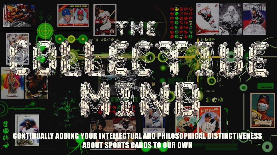
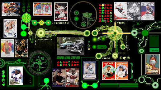
Here's the unmuted background. I tried to put the card images in places that wouldn't be covered up by the titles so much this time. And I used significant images from the last couple years, especially the masked Mantle, the Russian hockey cards, and the custom Hamlin. The Rev'd Up in the top left corner is a rainbow collection, the Grant Jackson rookie was a long hunt that ended well, and the Paige Spiranac is a recent acquisition. I realized last week that I haven't ever finished the Heritage Pairs series that I started in 2020. Would you like to see it continue?
In honor of the milestone post number, I'm going to figure out some sort of giveaway, which I've mentioned before, I think. I have so much stuff I'd like to move and I know certain people can use, but I want to limit - or at least give first dibs - to those of you that have been loyal readers and commenters. The trick is matching you to the right stuff in an efficient manner. Stay tuned....


Congrats on 700! I dig the new look - like the background stretching down the sides.
ReplyDeleteHappy 700th, Greg! As far as the changes go, I liked the look of the sides on the previous version better, but even so, the new version still looks way better than the empty void that all of my blogs have on the sides.
ReplyDeleteCongratulations on #700! I didn't notice the changes to your banner until I read the post. But as soon as I took a second look at it, the Mantle stood out. Great job... on the banner and the blog. As for the Heritage Pairs posts...I'm a big fan of comparison posts... so if you write them, I'll read them.
ReplyDeleteEverything shows up fine on my end! Happy 700 posts, a great milestone!
ReplyDeleteOh yeah, I like those Heritage comparisons ... I like the change in the sides, a little less distracting. ... When I started the '93 Upper Deck blog, I realized how out-of-practice I was with choosing and tweaking blog templates, I've kept NOC relatively the same for about 5 years or so with no plans to change.
ReplyDeleteNice new look. Happy to see the Yankees so well represented. Congratulations on 700!
ReplyDelete👍
ReplyDeleteHappy 700! Currently reading on mobile so I don't see the sides. I thought the banner was a little busy at first, but the more I study it, the more I like it!
ReplyDeleteCongrats on your 700th post! I approve the design changes - looking good!
ReplyDeleteMick in a mask, very funny
ReplyDelete